Soak Up
Live brief with Discover Science Christchurch
Focus: Brand Identity, Naming, Tone of Voice
Team: Project completed with Rosie Dadswell and Abbie Coughlin
My Role: Logo concept, colour and identity, name, copywriting, advertising, tickets, uniform, merchandise
How can we make ocean science energising and inspiring for younger audiences?

The Challenge
Create a name and identity for a new immersive ocean science centre in Christchurch. By targeting families and school groups, the centre aims to inspire the next generation to pursue STEM and help fight climate change.


The Concept: Celebrating the Diversity of Ocean Science
The centre will showcase the incredible breadth of ocean science, so our identity needed to too. However, I recognised that all these topics could confuse and overwhelm the core audiences, so I distilled the centre's vision into four core aspects:


An Energising and Meaningful Name
The name ‘Soak Up - Ocean Discovery Lab’ encapsulates the centre’s vision; a dynamic, immersive experience that gets young people to soak up ideas and inspiration.


Brand Personality: Playfully Mischievous and Excited to Discover
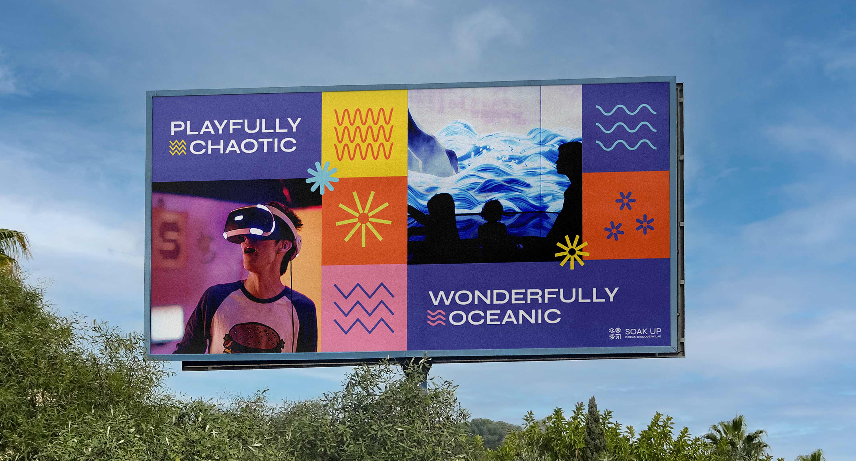
I crafted Soak Up's tone of voice to get through to groups which are notoriously difficult to engage, such as secondary school students. It breaks any preconceptions of science being stuffy, boring and difficult to relate to.


Flexible Design System
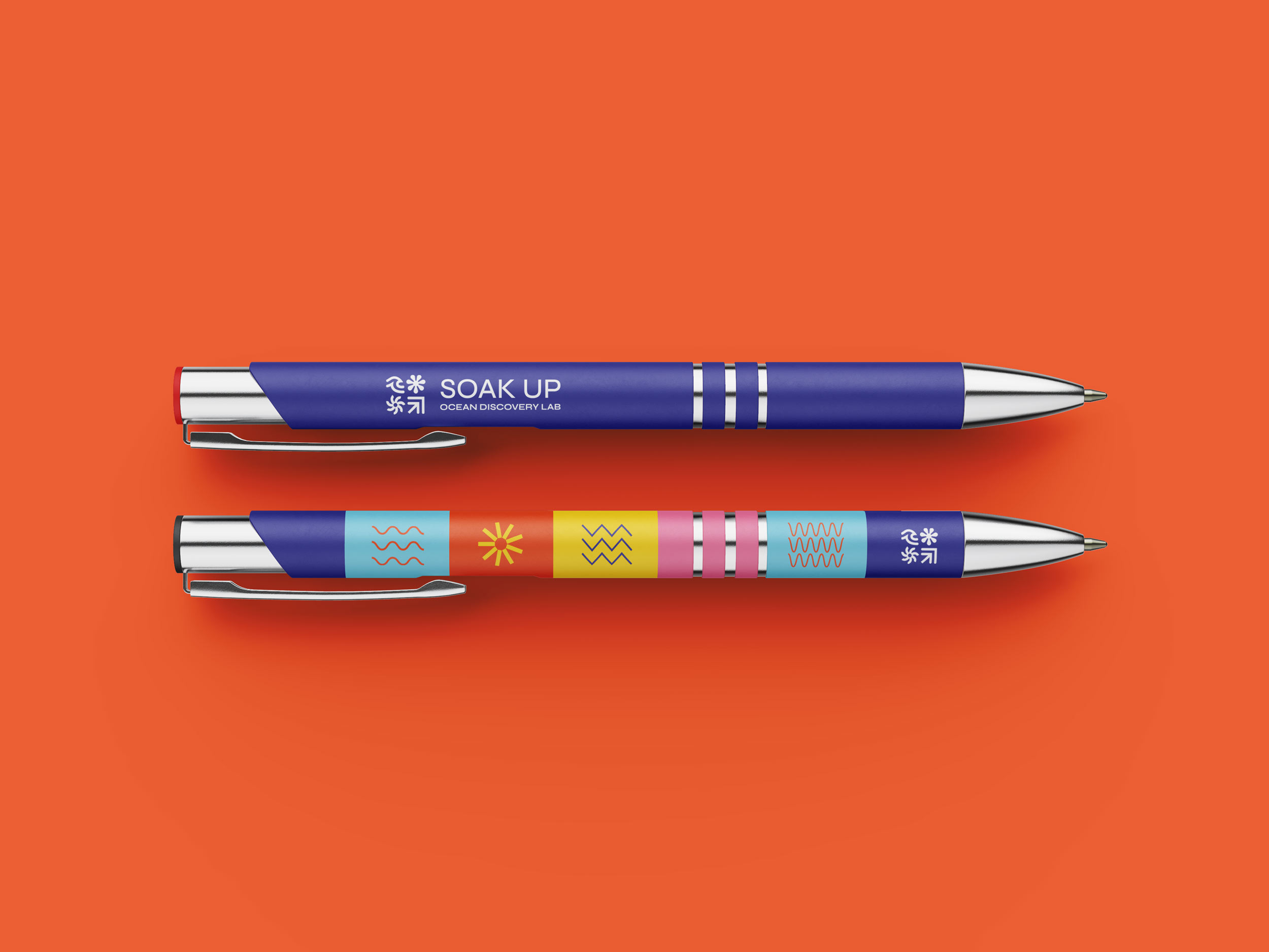
Soak Up's abstract icons depict oscillating waves, idea sparks and microscopic marine creatures. The iconography and colour system enables the centre to tone up the oceanic, scientific or innovative look for different themed exhibitions.


The Reaction
The team at Discover Science Christchurch praised our identity design; calling it "so much fun" and stating "you just can't help but smile when you see it!".
