Always
Firestarters 2022 submission
Focus: Brand Identity, Packaging, Tone of Voice
How can menstrual care brand Always pioneer gender inclusivity in an excessively feminised market?

The excessive feminisation of Always' current brand perpetuates the myth that periods are solely experienced by women; excluding transgender men, non-binary people and intersex people.
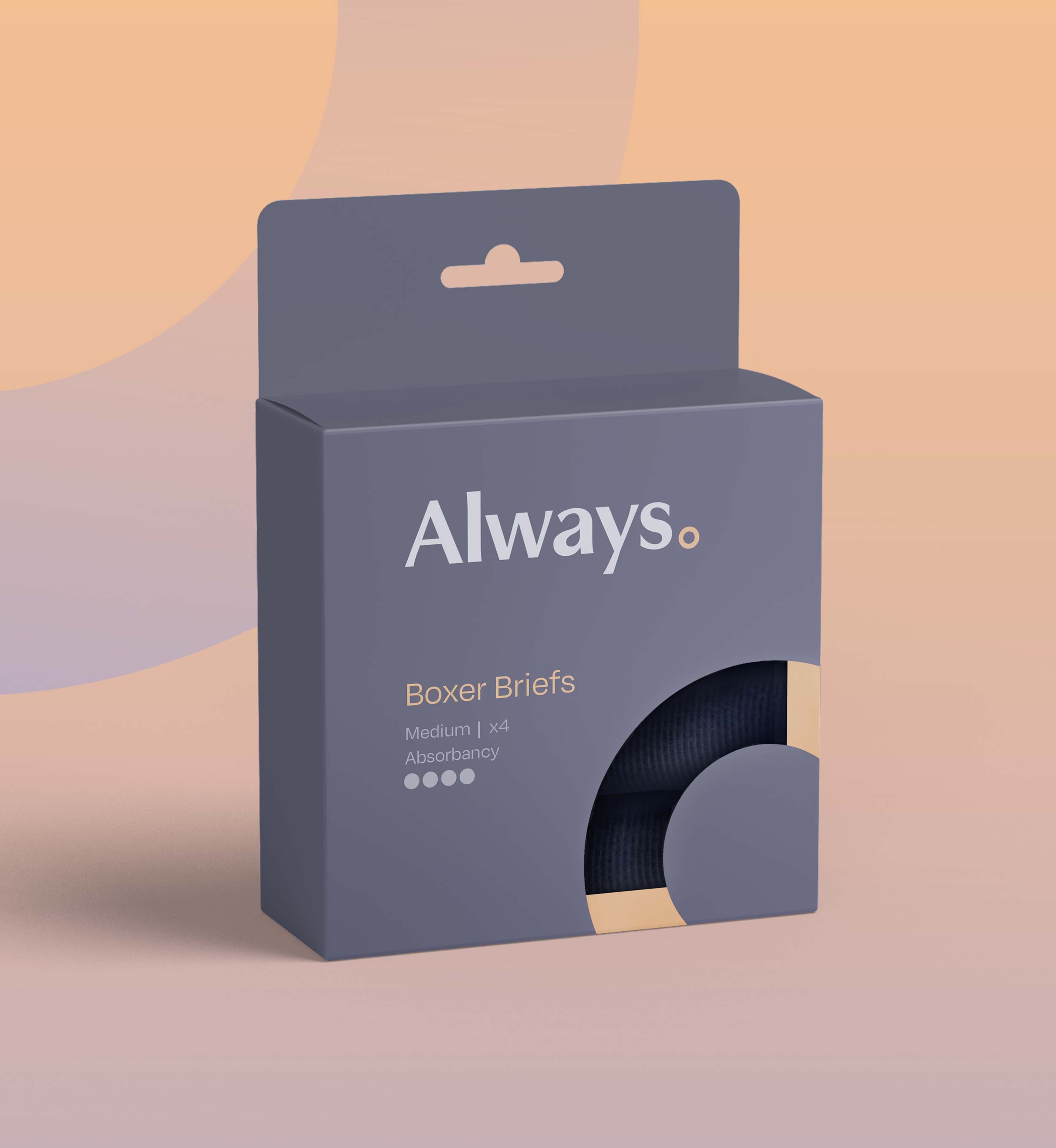
I repositioned the brand and created a new line of reusable period underwear to make Always more gender inclusive and sustainable.


Supporting the Full Spectrum
Always' colour spectrum acknowledges the broad spectrum of users that their products support. The ring logo mark, a symbol of eternity, is placed after the logotype to act as a period; a subtle visual reference to the word itself.


The Colour System
Grey packaging is used to indicate reusable products that cater to a heavier flow, and white indicates disposable, single-use products.

Balancing Inclusivity, Sustainability and Practicality
Some non-women who menstruate prefer using disposable products to avoid direct contact with blood, so Always' old plastic-based pad range will be replaced by new biodegradable pads.


Informed by Primary Insights
Speaking to non-women who menstruate helped to identify how interacting with a menstrual care brand can be made more comfortable:
- Neutral colours not tied to femininity
- Discreet design
- No gendered symbolism or exclusionary language such as ‘feminine hygiene’

The final identity stays true to Always’ compassionate brand voice, but brings the brand into the modern day through inclusive language, neutral design and gender-diverse imagery.
